THE KEY CONNECTION
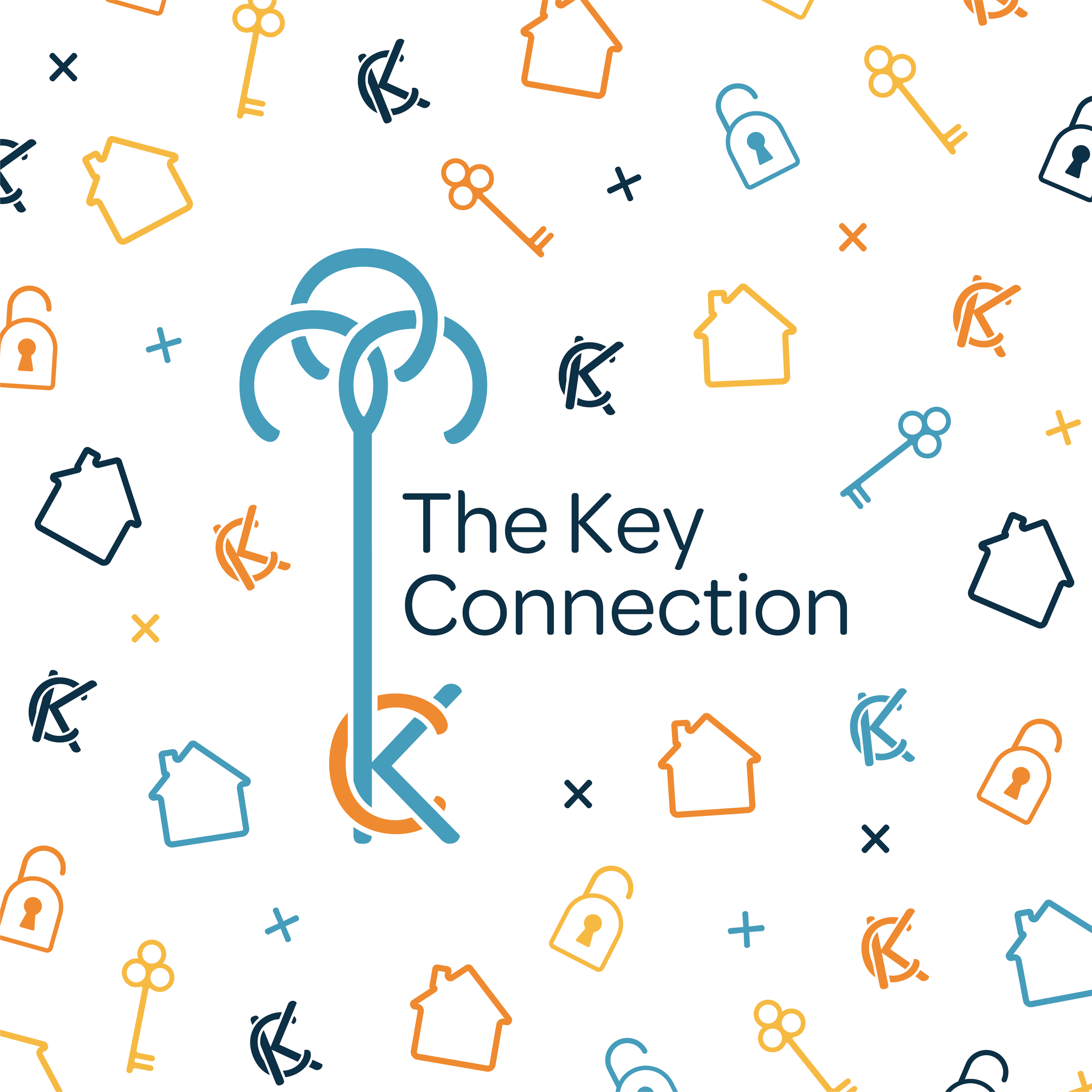
The Key Connection is a local real estate team that wanted a fun and inviting brand that could be applicable to every member of the team. They are focused on providing an excellent customer experience with a local touch.
THE CHALLENGE
The team was looking to create an approachable, strong, and memorable visual identity. The goal was to create a full identity package that would allow them to stand out while remaining easy for all members to follow. They asked for a minimal and inclusive style that could be used by all of their agents.
THE SOLUTION
We wanted to create a unique color palette that was different than any we have seen used in the real estate industry before. We used bright, friendly colors, and modern sans serif fonts to make sure the brand felt inviting and stood out among other real estate teams. Ultimately, we wanted to make sure the brand looks memorable, and felt approachable and local to the Greenville and Upstate South Carolina area.
PROJECT SCOPE
Brand Strategy: goals, personality, values
Unique Selling Proposition
Position in the market/competitive research
Determine target audience & client persona
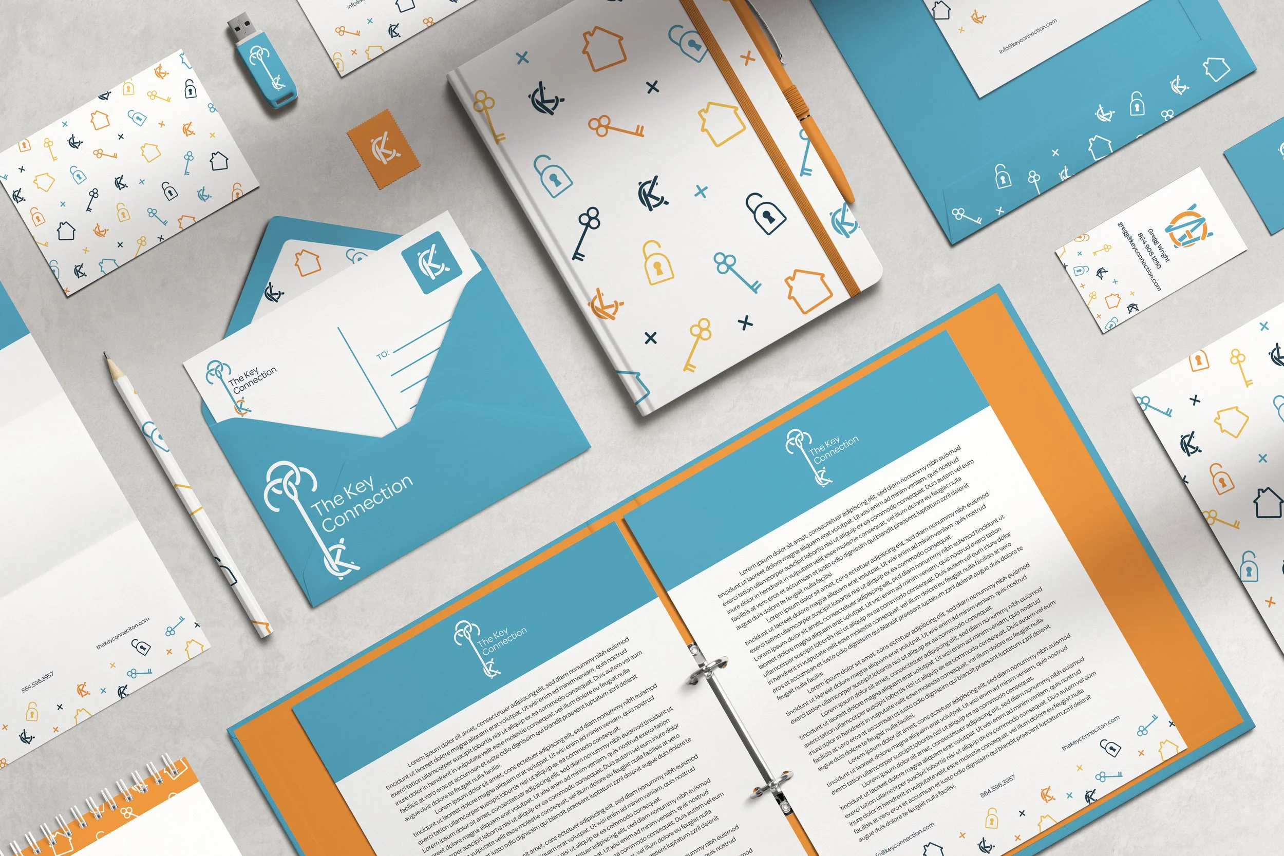
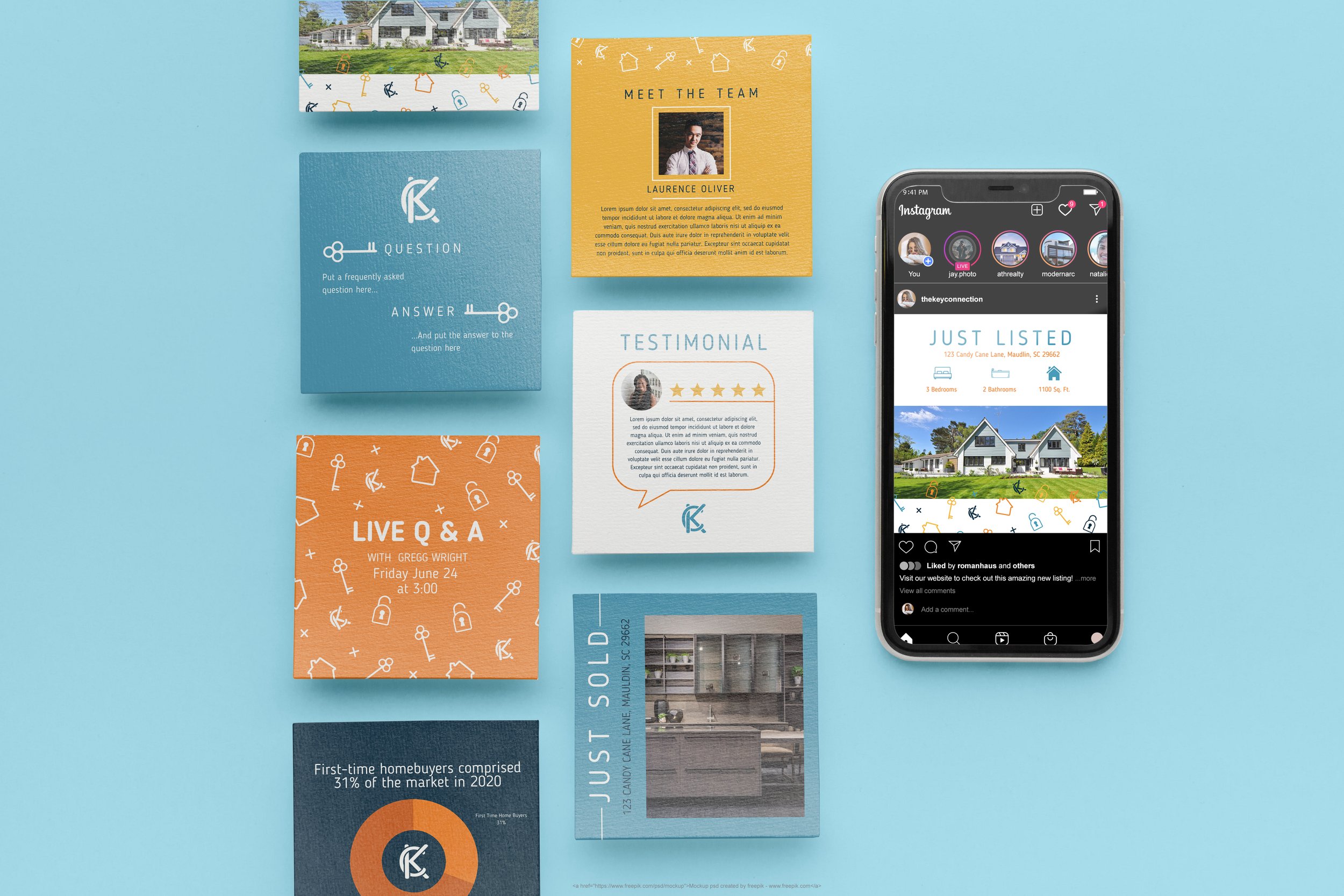
Visual identity (logo and submarks, color palette, typography suite, and style guide)
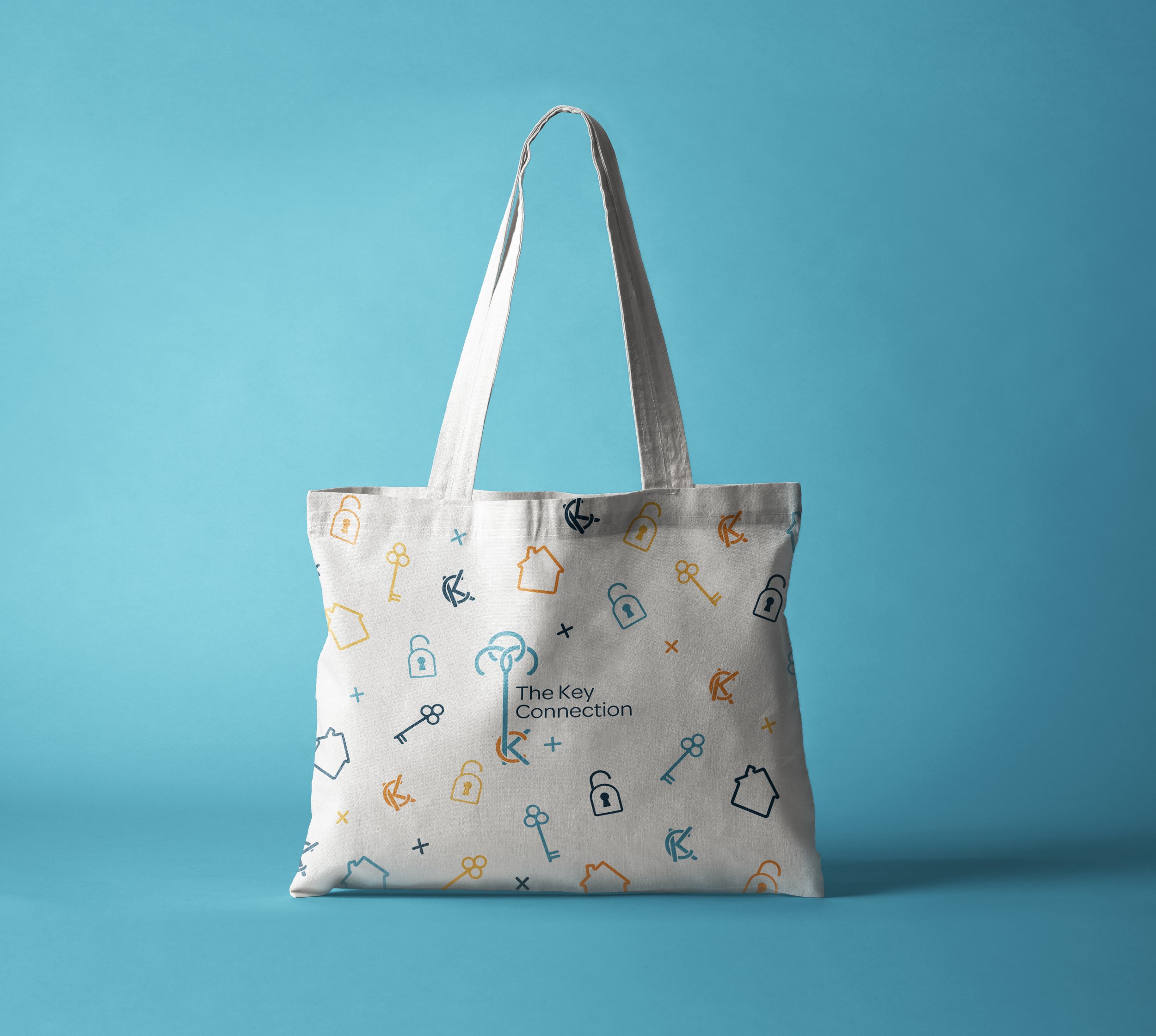
Product design
UNIQUE SELLING PROPOSITION
The Key Connection is an approachable network of highly trained and compassionate realtors that use their knowledge and vast connections within the industry in order to create a seamless and easy experience for their clients.
BRAND VALUES
Integrity
Trust
Communication
Tenacity
BRAND PERSONALITY
Confident
Approachable
Trustworthy
Cool




FONTS AND COLORS
