CRUX + COMPASS
Crux and Compass is an online fitness blog and social media profile that focuses on survival and extreme conditioning. They stress the importance of discipline by putting on monthly extreme-fitness goal challenges that are meant to push you to your limits physically and mentally.
THE CHALLENGE
Crux and Compass was operating with home-made branding that didn’t feel polished. They wanted to take their social media to the next level by making it cohesive and attractive. They wanted it have the vibe of adventure and an outdoorsy feeling to reflect the fact that most of their fitness challenges are based on survival and done outdoors.
THE SOLUTION
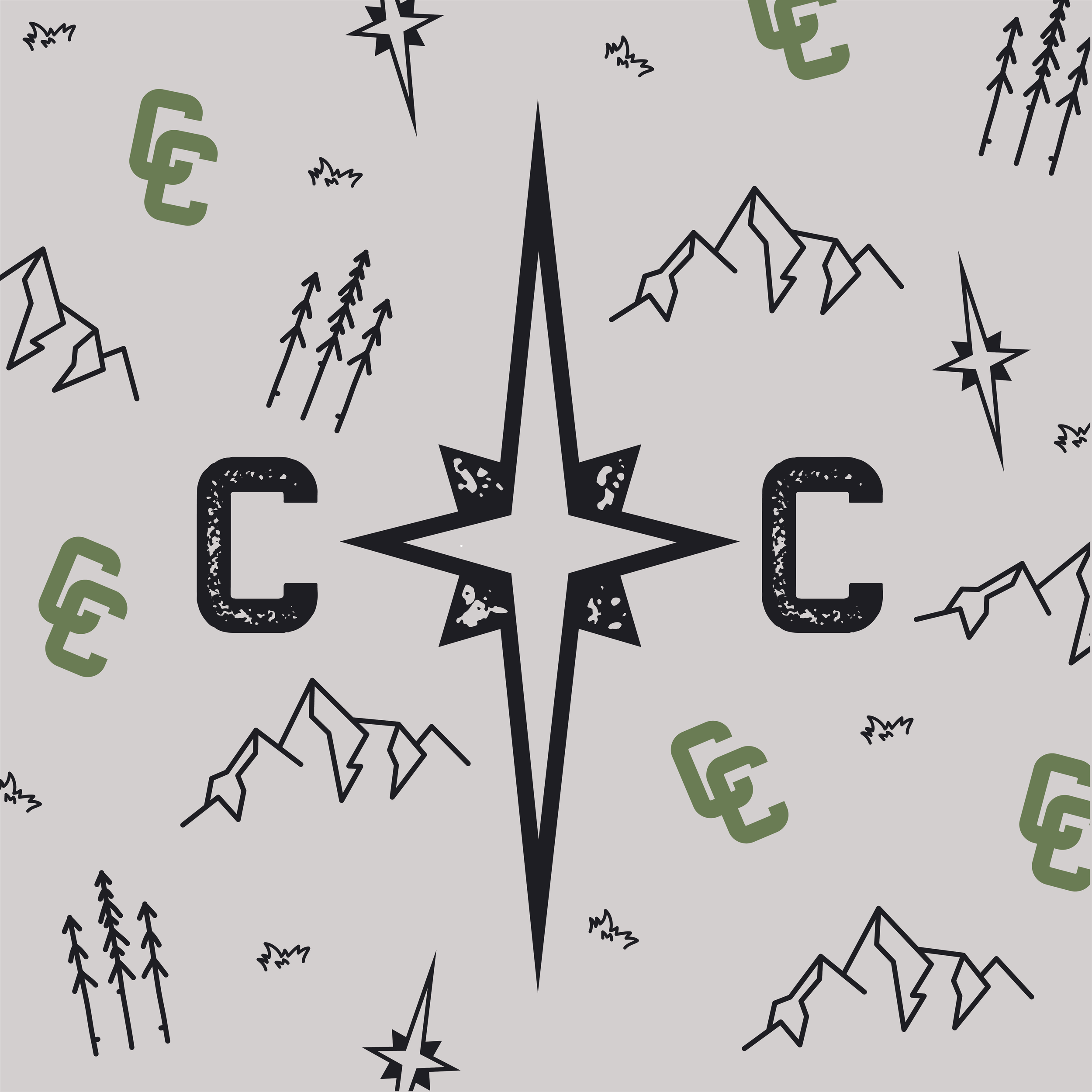
We chose a moody nature-inspired color palette to convey the outdoor feeling, while keeping the hard-core fitness look. The main pattern for this branding is a topographical map, to further convey the outdoor theme without being so literal. The fonts chosen for this branding were selected to feel gritty and dirty, while being bold and impactful at the same time.
PROJECT SCOPE
Brand Strategy: goals, personality, values
Unique Selling Proposition
Determine target audience & client persona
Visual identity (logo and submarks, color palette, typography suite, and style guide)
Social media templates
Product design
UNIQUE SELLING PROPOSITION
Crux and Compass is an extreme outdoor fitness blog and influencer brand that focuses on survival-type workout challenges to push followers to their limits physically and mentally.
BRAND VALUES
Adventure
Challenge
Community
Growth
BRAND PERSONALITY
Determined
Confident
Dedicated
Principled


FONTS AND COLORS


